
Comparison of Page Layouts
How well does Geiriadur yr Academi [GYA] present the information it contains? Is it clear and easily accessible?
Old-style dictionaries make things hard work. Looking at a long entry in a large dictionary, it’s easy to feel put off. Rather than spend long minutes ploughing through all those lines of text, and at the end still not feel sure whether or not what you were looking for was lurking there somewhere, it’s tempting to give up in frustration and just say something else instead! Many entries in GYA run to five or six monotonous columns; category numbers (intended to divide long entries into different senses of the word) just get lost in a jungle of dense type, and anyway it’s often far from clear what the logic behind the categorisation is and what ought to be in which category. The same typeface is used throughout, so that it’s difficult to make things stand out properly.
Many people assume that a dictionary must look ‘like a dictionary’, meaning the old-fashioned ones they remember from school, and that nothing much can be done on the printed page to make the information easier to get at. In fact that’s far from true: intelligent design, incorporating a wide range of typographical gadgets and entries with a carefully-thought-out logical structure, can lead you to the sense or phrase you need in a fraction of the time it would otherwise take. And why should a dictionary have to look boring or difficult in order to be taken seriously?
Again, as a point of comparison, let’s use the Collins–Robert English–French Dictionary [CR]. Consider the visual impact and practical effectiveness of the page layouts shown here, in terms of how easy on the eye the page is, and how easy it is to find what you want on it.
Here is part of a page from GYA:
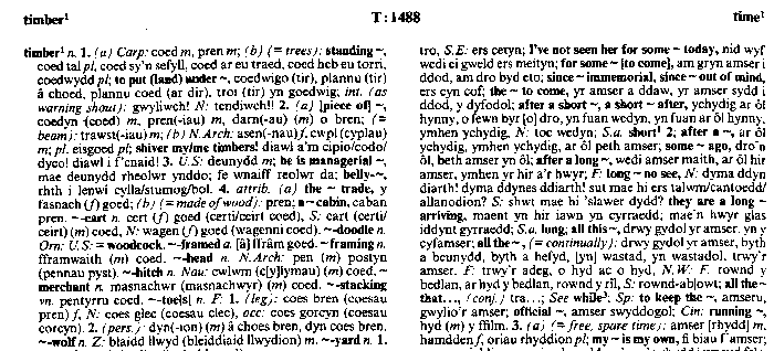
© 1995 Bruce Griffiths and Dafydd Glyn Jones
Note the visual monotony of the GYA page: it seems to use only one typeface, plus its bold, italic and bold-italic versions. Everything in the text, even the headwords, is in the same size of type as everything else. There is no constructive use of white space, for example in the form of paragraphing, and the ordering of material within the entry is obscure. The whole appearance of the text is disorganised, archaic and unfriendly. By contrast, the page below uses a tremendous variety of symbols and different typefaces, enabling a greater range of information to be presented in an accessible and attractive form:
© 1998 HarperCollins Publishers and Dictionnaires Le Robert
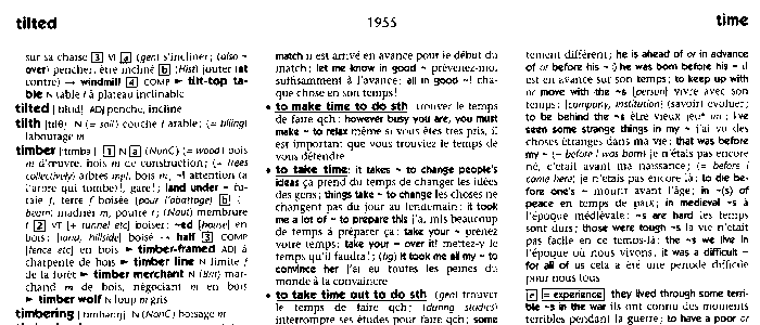
It’s not easy to get a clear to get a clear picture from these scanned images. Let’s zoom in a bit and look at the entry for timber. First, GYA:
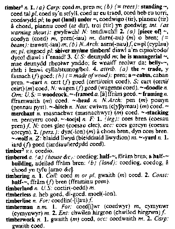
© 1995 Bruce Griffiths and Dafydd Glyn Jones
CR doesn’t run to such out-of-the-way material as belly-timber and timber-toes, so the entry is quite a bit smaller and hence less difficult to present clearly. But even allowing for that, CR’s timber is considerably easier and more pleasant to read than GYA’s:
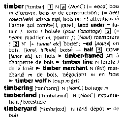
© 1998 HarperCollins Publishers and Dictionnaires Le Robert
Some serious thought has gone into how the typography can be made to highlight different sorts of information, using underlining (above, in the first sample), chevrons to pick out subentries (hyphenated and non-solid compunds), boxes around category numbers (separating the various parts of speech, such as noun and verb, or different meanings) and so on. There is a clear contrast between the chunky bold type used for headwords and other source-language items, and the the lighter typefaces used for their translations. The headwords are in a larger font than the rest of the entry, and the codes showing genders (m and f) smaller. And leaving as much white space as possible allows the entry to look clean and uncluttered. It all helps!
References
 Collins–Robert French–English, English–French Dictionary: Unabridged (5th ed. 1998). Glasgow: HarperCollins Publishers, ISBN 0-00-470526-2, £23.99 h/b.
WEBSITE: http://titania.cobuild.collins.co.uk/crv
 Griffiths, Bruce (ed.) and Dafydd Glyn Jones (assoc. ed.) (1995) Geiriadur yr Academi: The Welsh Academy English–Welsh Dictionary. Cardiff: University of Wales Press, ISBN 0-7083-1186-5, £40.00 h/b.
Becoming available online at http://www.swan.ac.uk/uwp/wa_index.htm.
back to dictionary reviewsdictionaries index
© 2000–2001 Harry Campbell
Page added: June 2001